




Keeping A Multi‑Team React Library Cohesive With Icons8 Icons

The Real Problem: Five Teams, Five Icon Dialects
Shared React libraries often fall apart at icons. One squad pulls in Feather for an admin panel, another lifts a few Material icons as inline SVG, a third pastes PNGs from a marketing deck. Each choice looks harmless in isolation. Line up all five products and the interface feels stitched from spare parts.
Hiring an illustrator to build a custom set sounds ideal, but that means briefs, reviews, and ongoing work every time someone invents a new status, device, or abstract “business growth” concept.
Icons8 Icons sits in the middle. You get a huge, structured icon library you can standardize on, without owning a full‑time icon pipeline.
What Icons8 Actually Gives You
Coverage is broad enough to support most app ecosystems in a consistent visual language:
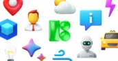
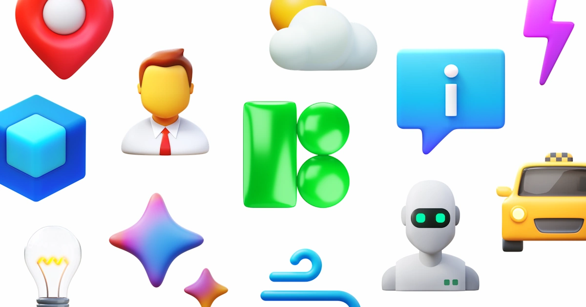
- 1,476,100+ icons across more than 45 visual styles
- Style packs with 10,000+ icons each, so teams don’t mix sources
- Platform-tuned sets: iOS 17, Material, Windows 11, emoji, 3D, and more
- 4,500+ animated icons for microinteractions and marketing
Formats fit neatly into a React stack. Paid plans offer SVGs for inline React components, PNG up to 1600 px for docs and decks, plus PDF for print. Animated icons ship as Lottie JSON, GIF, or After Effects projects, which covers most product and motion workflows.
Three categories (Popular, Logos, Characters) stay fully open in all formats, handy for prototypes or internal tools. They still need attribution and some caution around trademarks.
Scenario 1: Rebuilding Navigation Across Products
Imagine the design system team decides all web apps should share a unified side navigation. You pick one style, say an outlined iOS 17 set, and run the process end to end.
1. Search and choose a style
In Icons8, filter by style and platform, then search by text for primitives: dashboard, settings, analytics, notifications. AI search and synonyms make queries forgiving; typing “stats” still finds analytics icons.
2. Find the domain icons
For business concepts, start with a curated set such as the business icon collection, then narrow by topic. That cuts down on mismatched metaphors and odd visual outliers.
3. Normalize appearance in the editor
Click an icon and the browser editor opens. Recolor, tweak padding, rotate slightly, or add a common stroke. Test exact colors with HEX codes and save a palette that matches your design tokens.
4. Organize as a system asset
Every chosen icon goes into a shared “Navigation v2” collection. Collections act like a small asset manager: drag and drop icons, rename the collection, add a description, and later export everything in one go.
5. Export for React
From the collection, export SVGs, a sprite, or an icon font. On the React side, wire those into your existing `<Icon />` component. Now every product team pulls from the same source and style, with no one grabbing random assets from Google Images.
Ad‑hoc icon hunting turns into a predictable pipeline the design system can actually govern.
Scenario 2: Empty States And Motion Without New Artwork
A few months later, product managers push for more expressive empty states and loading indicators, but there’s no motion designer on staff.
Switch to Icons8’s animated icons:
- In search filters, select animated icons only, then browse categories that match UX states (errors, sync, chat, onboarding).
- Download Lottie JSON for in‑app animations, hook it to your existing Lottie React wrapper, and keep motion consistent across products.
- For marketing or presentations, grab matching GIF or After Effects files so slides and landing pages echo the product UI.
Because static and animated icons live in the same visual families, loaders, success ticks, and empty illustrations feel like part of the same system as the everyday icons in your React components.
A Week In The Life With Icons8
Tuesday morning, you’re cleaning up a device management module. Open the Icons8 Figma plugin with the designer and swap a legacy mix of Heroicons and PNGs for a single Windows 11 outline style. The designer drops icons straight into Figma screens, you bookmark the same ones in a “Devices” collection, and by the afternoon you’ve exported SVGs and updated React components.
Later that week, a content manager needs icons for a release deck. Instead of cobbling together a new set in PowerPoint, they open the Google Docs add‑on, insert the exact icons from your shared collection, and keep the deck visually aligned with the product UI.
Over time, shared collections (Favorites, Downloaded, plus your custom sets) turn into the visual vocabulary for any team that ships an interface.
Practical Tips For Using Icons8 With A Component Library
- Pick one primary style per platform and document it in design system guidelines. Icons8 offers enough icons per style that mixing becomes rare.
- Treat collections as “canonical” sets for navigation, statuses, content types, and domain ideas. Export from those instead of from one‑off searches.
- Toggle off simplified SVG before export when designers need editable paths in Figma or Lunacy.
- Standardize colors in the editor so exports already match design tokens and you avoid per‑icon overrides in React.
- Use bulk recolor for theming when building dark mode or brand variants from the same base collection.
How It Stacks Up Against Alternatives
In‑house icon sets
Total control, high cost. Every new feature spawns an illustration ticket, and cross‑designer consistency is hard. Icons8 trades some uniqueness for reach and speed: you get continuity across 45+ styles without running your own production line.
Open source packs like Feather or Heroicons
Perfect for small apps and zero‑cost licensing. The tradeoff is depth and variety. Feather or Heroicons offer a few hundred or thousand icons in a single look. Once you need niche concepts or animated variants, a second pack sneaks in and your style drifts. Icons8’s volume per style reduces that pressure.
Marketplaces like Flaticon or Noun Project
Huge variety, weak consistency. You either spend hours hunting matched sets or accept a patchwork. Icons8 lets you filter by in‑house vs independent designers and focus on style packs where each set is curated to be visually coherent.
When Icons8 Is Not The Right Choice
Icons8 doesn’t fit every team.
- Brands built on a distinctive hand‑drawn or experimental icon style won’t get that level of uniqueness from a shared library.
- Teams that must stick to open source licenses, or can’t provide attribution anywhere, will hit limits with the free tier and may prefer permissively licensed packs.
- When you only need standard platform icons that ship with iOS or Material, and don’t plan to go beyond that, native sets might stay simpler.
- Logos and character icons in Icons8 come with trademark constraints, so for heavy commercial use you still need approvals from trademark owners.
Knowing these limits helps avoid overcommitting to a tool that clashes with your constraints.
Where Icons8 Fits In A Real Design System
For a frontend developer stewarding a React component library across multiple product teams, Icons8 Icons becomes a scalable shared vocabulary. Large coherent style packs, practical formats, in‑browser editing, and collection management let you centralize icon decisions without turning into the company illustrator.
You keep the flexibility of code‑driven components and modern workflows, and hand off the repetitive grind of icon production to a library that has already done the heavy lifting.
A video game enthusiast ever since I first got my hands on a Game Boy. Over the years, I've played many different games across various genres, discovering hidden gems and niche titles along the way. I'm also passionate about technology, always up-to-date with the latest news and insight in the PC and Console market. Ready to share and bring you the latest news !
Download the Allkeyshop Browser Extension Free
For all the latest video game news, trailers, and best deals, make sure to bookmark us.
You can find all the best and cheapest online deals on CD keys, game codes, gift cards, and antivirus software from the verified CD key sellers on our store pages.
To not miss any news on Allkeyshop, subscribe on
Google News
.




Comments (0)